At first it seemed very daunting to try and create this magical thing that I just learned about, and being under a self-starting lead, I was set loose to sort of figure out how to do this. The first thing I did was create this case study and figure out what design systems are, why Monster needs it, and what steps we need to take to reach this goal we all have in mind. Here is a presentation I presented to teams to educate what, why, and how to design system.
Click through the slides.
After finding the diligence to understand the goals and what we needed as a brand to be unified, I created an initial baseline sheet to follow so we don't get too far off track. You can see the process below and the effective proposal I brought to management in order to get this project on going.

We wouldn't be able to just design whatever we wanted. After collaborating and talking with our development team, we all agreed that we would all be referencing the same framework: Material Design Bootstrap, which is a framework that uses bootstrap while also adhering to Google's Material Design guidelines.

No pun intended, but we quickly found out that this Monster was going to get out of hand really fast. In addition to a light design that MDB is defaulted to, we needed to design a dark mode in addition. We actually hired another designer to accompany me in designing this Design System. We tackled each and every aspect of the design system in sprints, after a couple months of referencing Google's Material Design, we would find ourselves getting very efficient and creating these components. We documented everything we had in terms of instructions, guidelines, and definitions within InVision's Design System Manager, or DSM.


Well not quite, this project is still a work in progress, but we have released the v1 of our design. The next steps is to implement the design system with a couple of internal applications and we will test the validity of the design system. Here are a couple examples of dashboards, CMS, and other applications we've designed for.


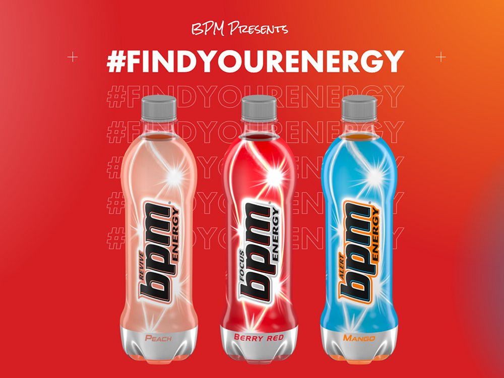
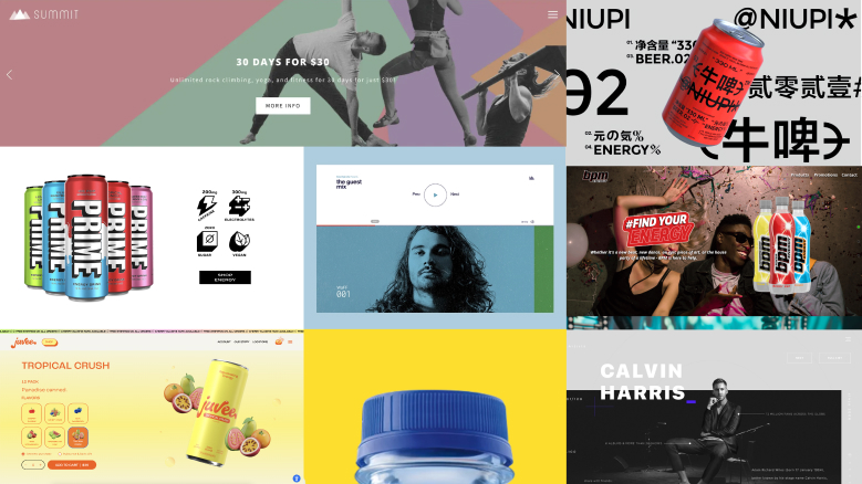
With BPM Energy, I was provided a creative brief with little to no references/inspiration. For this site, I wanted to embody the idea that this is a refreshing new drink with a slight emphasis on the lifestyle part of the brand.
With these ideas, I went out to find a couple of sites and components that I really wanted to implement with this brand. One thing that came out to me was the idea of having a site that purely scrolls horizontally on Desktop. The mobile site scrolls vertically while keeping the same design and branding cues.
With this Project, I also created a design style guide for the UI site. This includes specific fonts, H1s, Paragraphs, and Buttons.
I've linked the prototype below. Please use the fullscreen feature on the prototype on the top right. It is optimized for desktop devices only.
You can see the dedicated link here:
Design Style Guide
With the concept of a side scrolling site in mind, the team believed that with this project we could skip wireframing and continue with the site, as the branding/style guide and vision I had provided was enough for me to get straight into the comps.
You can see the figma prototype with animations here: Prototype with Animations
I also created a static version without animations here: Static Prototype
You can see the live site here: www.bpmenergy.com

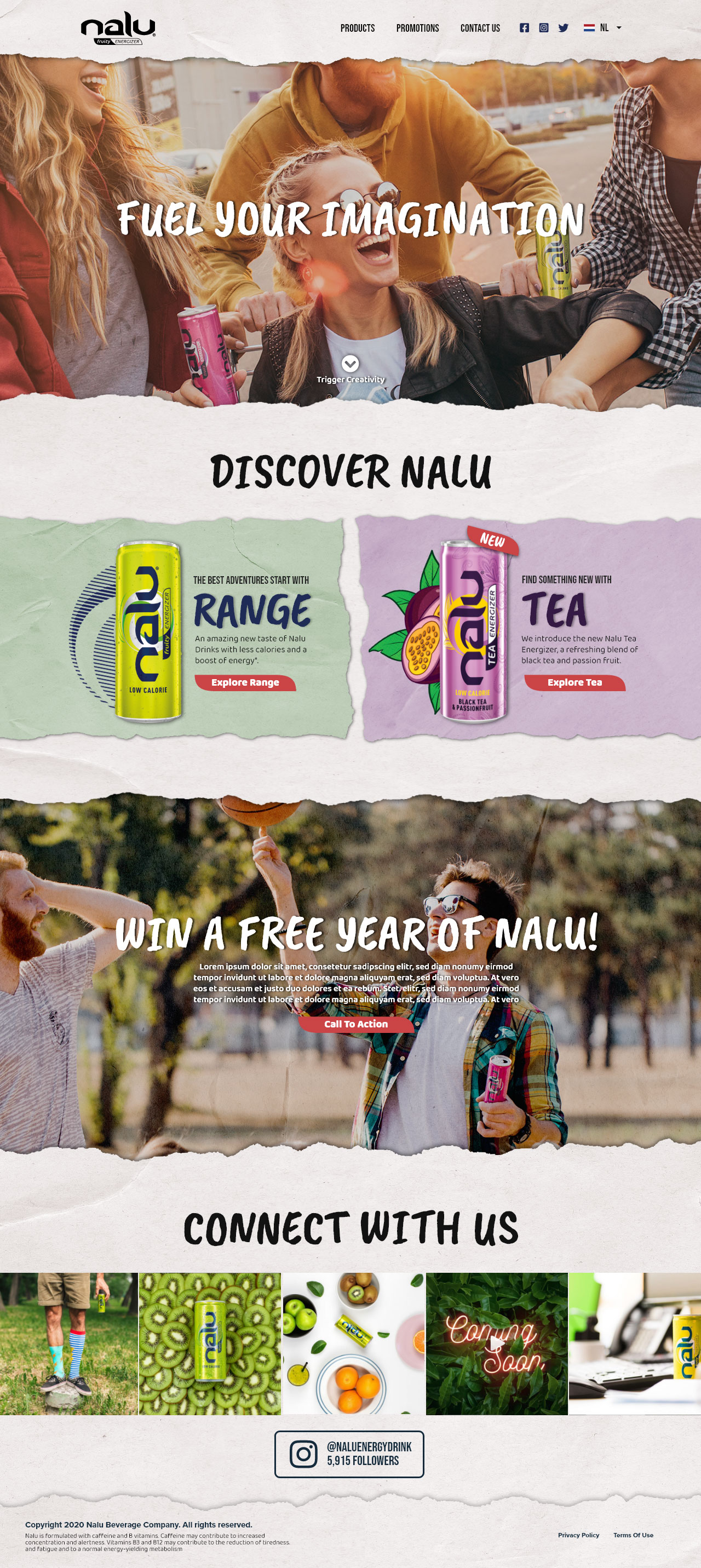
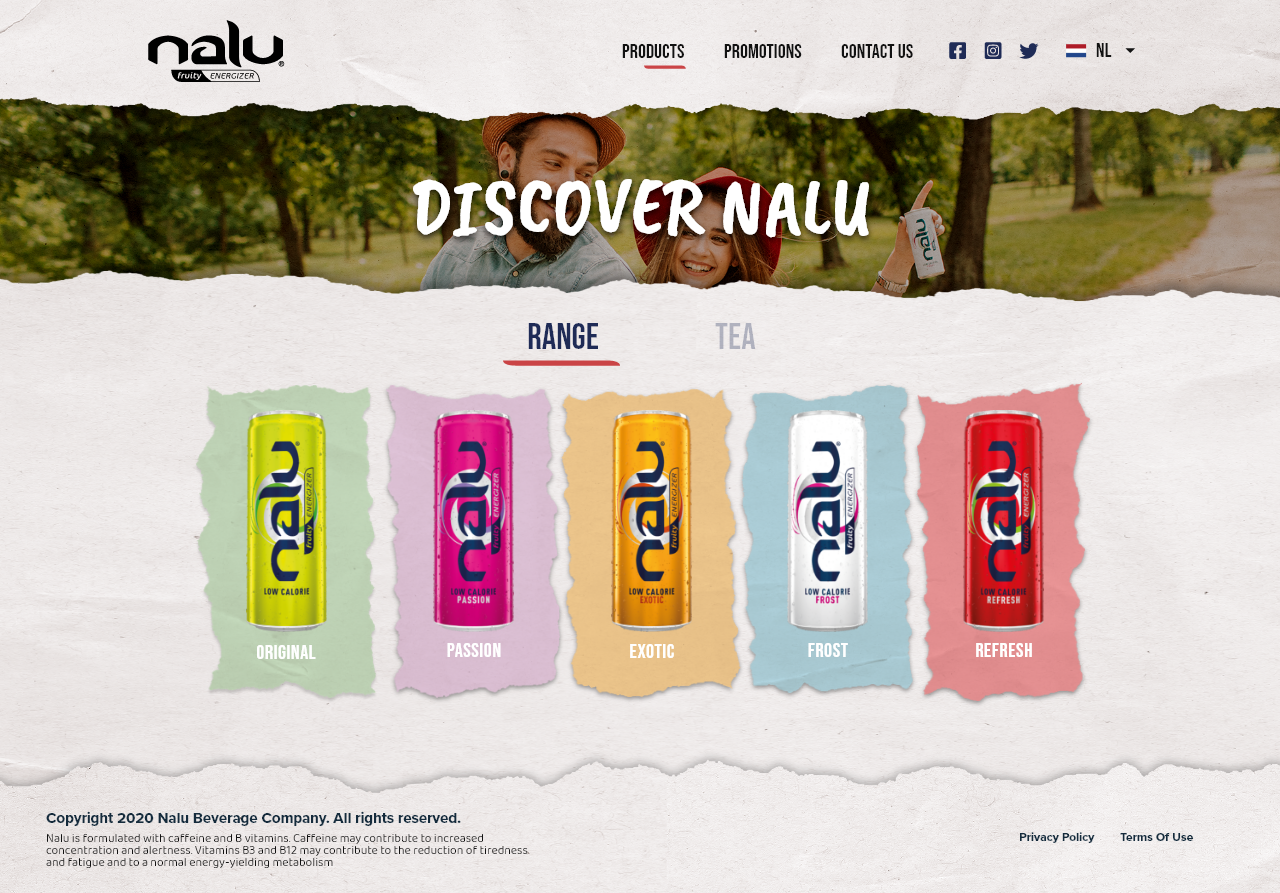
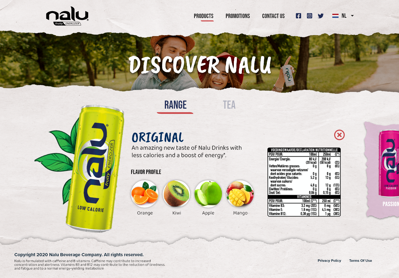
First things first, we start with a mood board, a collage of current assets used for ideation and brand identity. Nalu had already been an established brand, but at the time of this project, the Nalu brand got a complete rework in regards to creative direction and brand mood.

For the initial process, I was to provide Nalu stakeholders with at two different wireframe directions. Given the new assets for the site, I decided to double down on the ripped paper effect that the new Nalu promos seemed to pull off effectively.
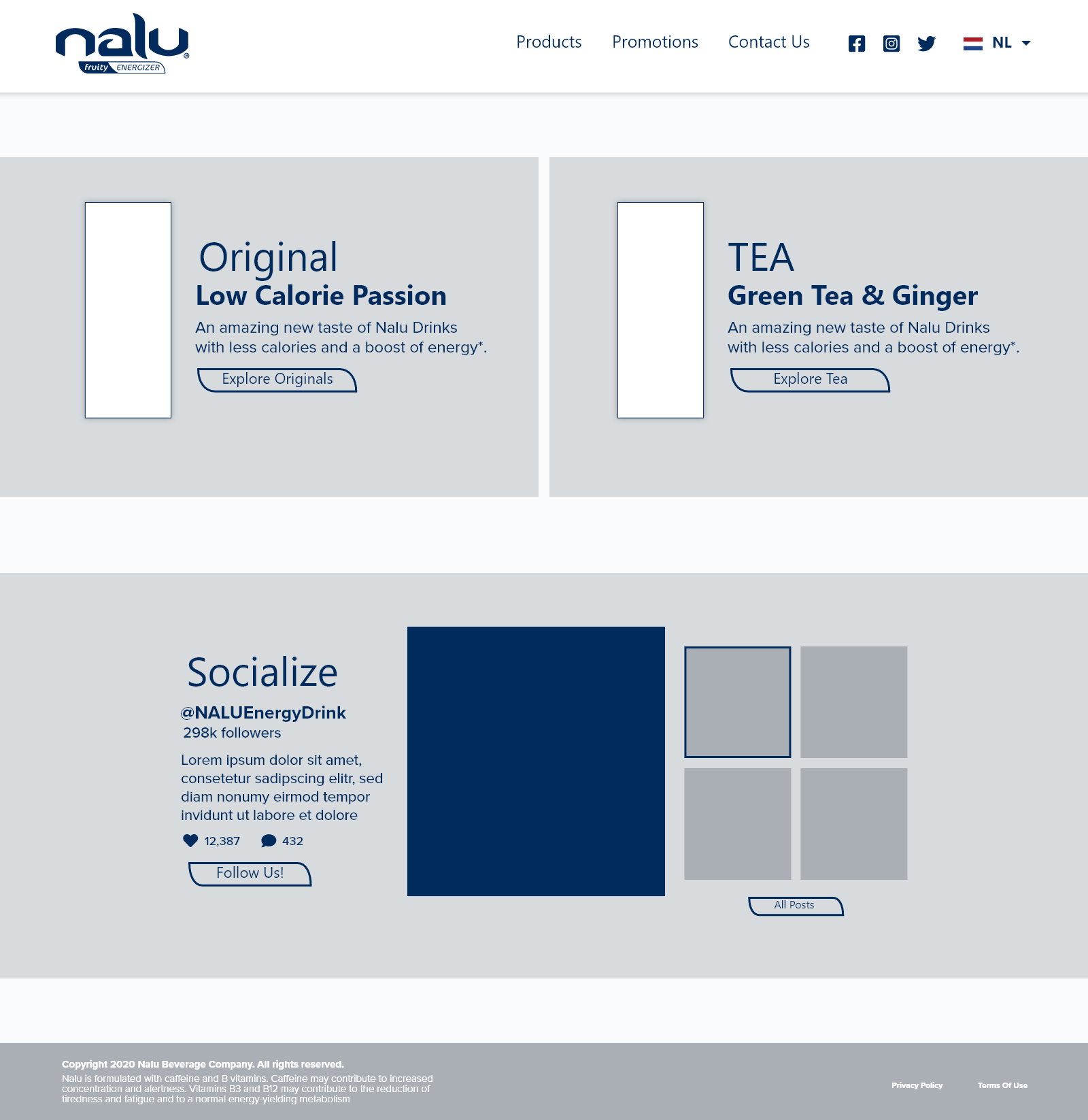


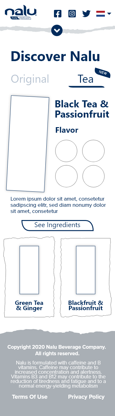
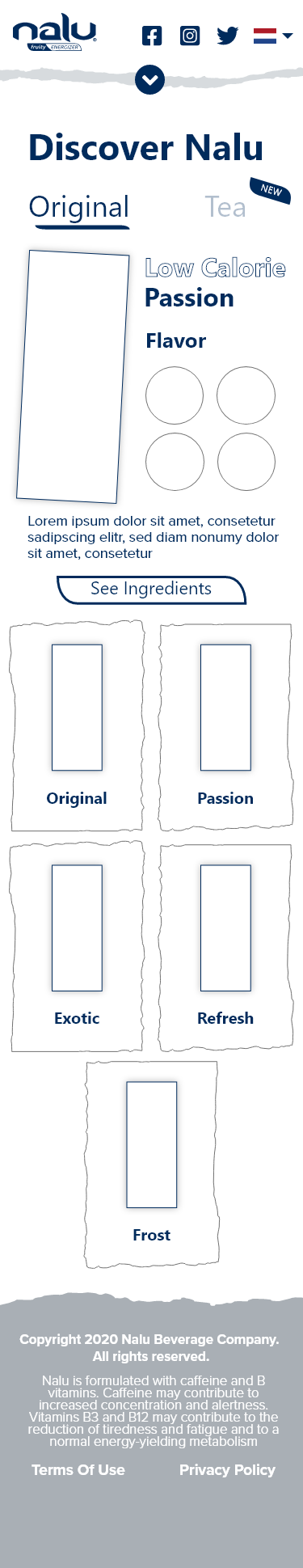


Upon discussing various versions of the final comps, stakeholder felt that more imagery was necessary for the brand aesthetic, therefore hero images were added to each page, with a warm, inviting effect.
If the comps are too laggy and loading too slow, you can find the web prototype here, and the mobile prototype here.

During this time, Monster had been short handed and we did not have the man-power or time to properly do a full design process for these comps, therefore the challenge at hand was to design a whole website without any brand support or supporting data.
If the comps are too laggy and loading too slow, you can find the web prototype here, and the mobile prototype here.
The current Monster Request Management System had already existed, and the team running the system tasked our team to apply our already completed Design System to the application in order to improve user familiarity and adhere to the monster internal aesthetic. As you can see on the left, the interface is relatively overwhelming, and instead of having everything on one screen, we decided to break everything out into steps.
The main solution that we came up with was to essentially break up the interface so that users are not bombarded with so many actions. In order to figure out how to break the interface into steps, we did a rough set of user flows. An example of the Job Creation user flow is shown below.

After referencing the existing screens, we went ahead and followed all of our user flows to build out the comps. Since we had the design system already completed, we didnt have to go through any wireframing or anything, we just jumped right into creating the design.


After initial design was complete, we insisted to conduct user testing on a couple of the flows for the pertaining team. We had user tests for each of the departments included. Here is an example of the prompt we give users to go through. We are able to gain a lot of feedback and qualitative data from a set of the actual users.